20Twenty
Rick Smee, photographer • Year 2017
The challenge
A monthly newspaper for a photojournalist's pictures of protest and change.
In 2017, in London, photographer Rick Smee wanted a periodical for his reportage: one issue a month, each one devoted to a moment of unrest, protest or revolution he had photographed.
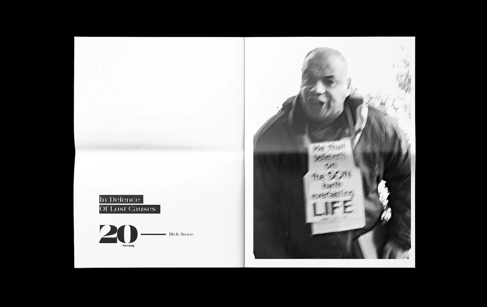
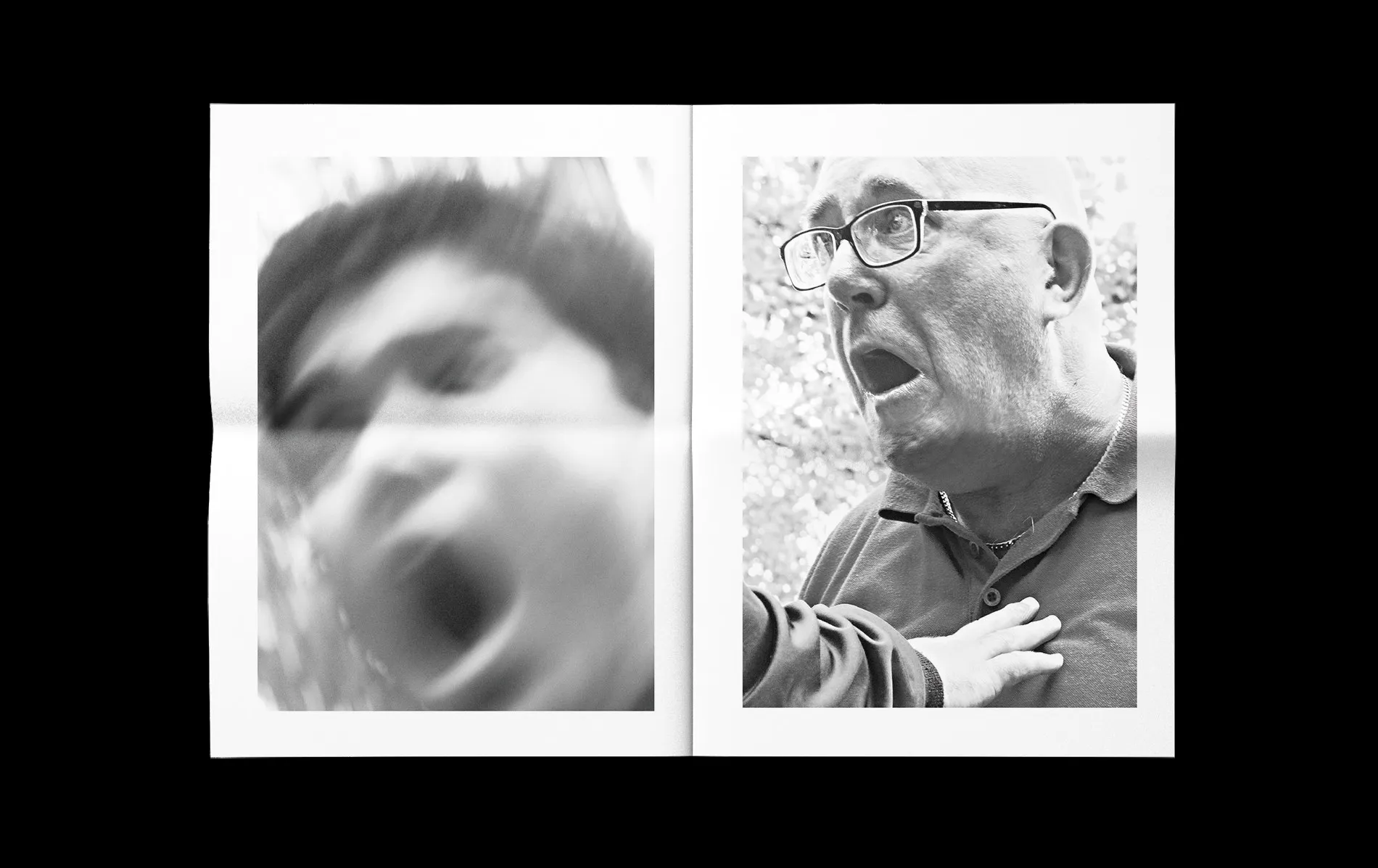
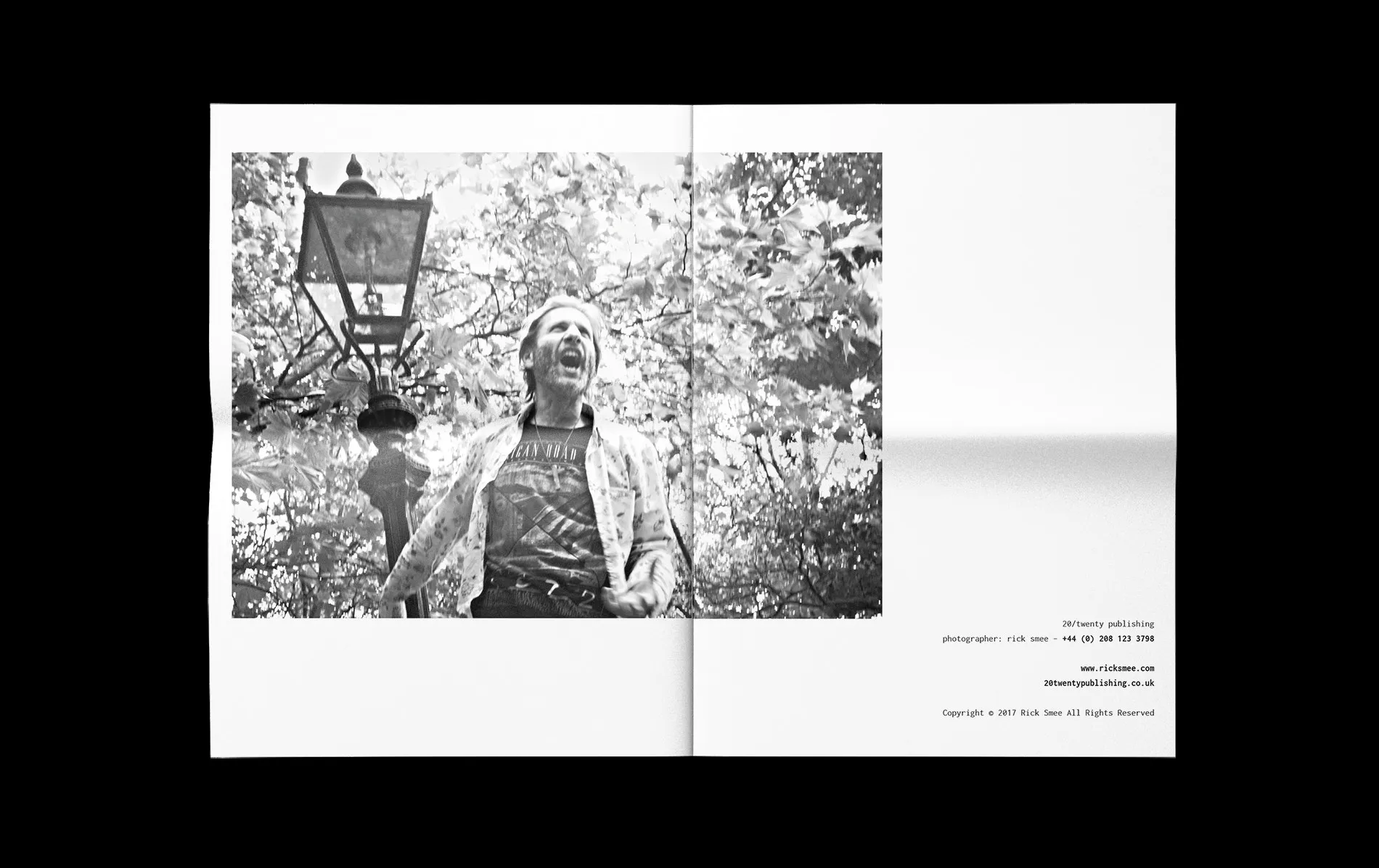
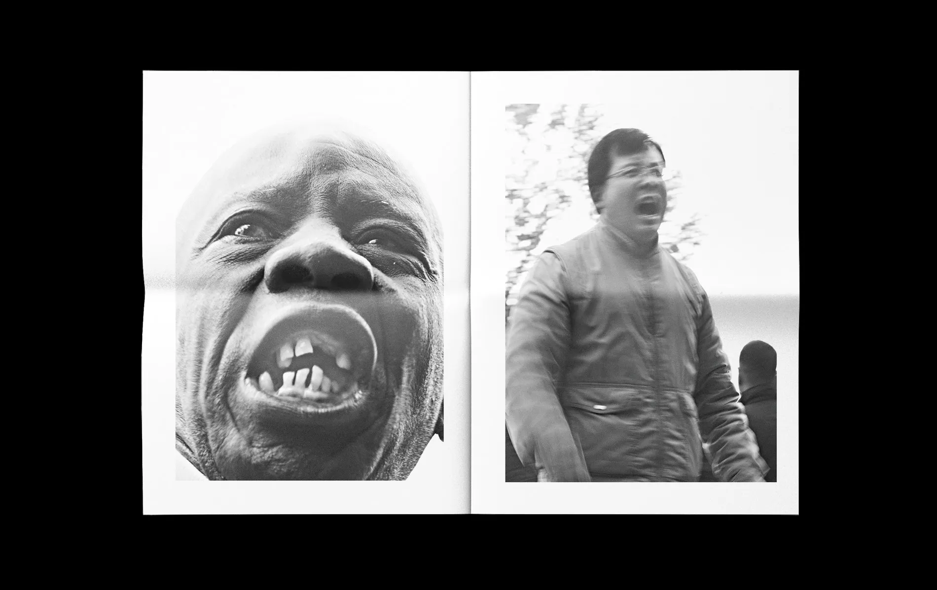
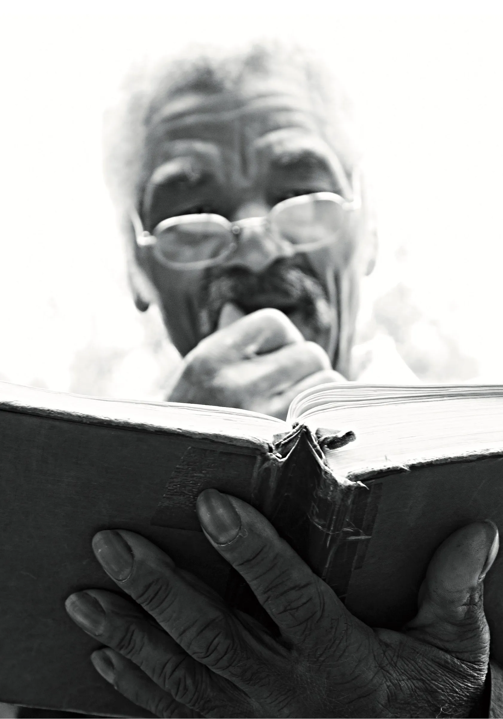
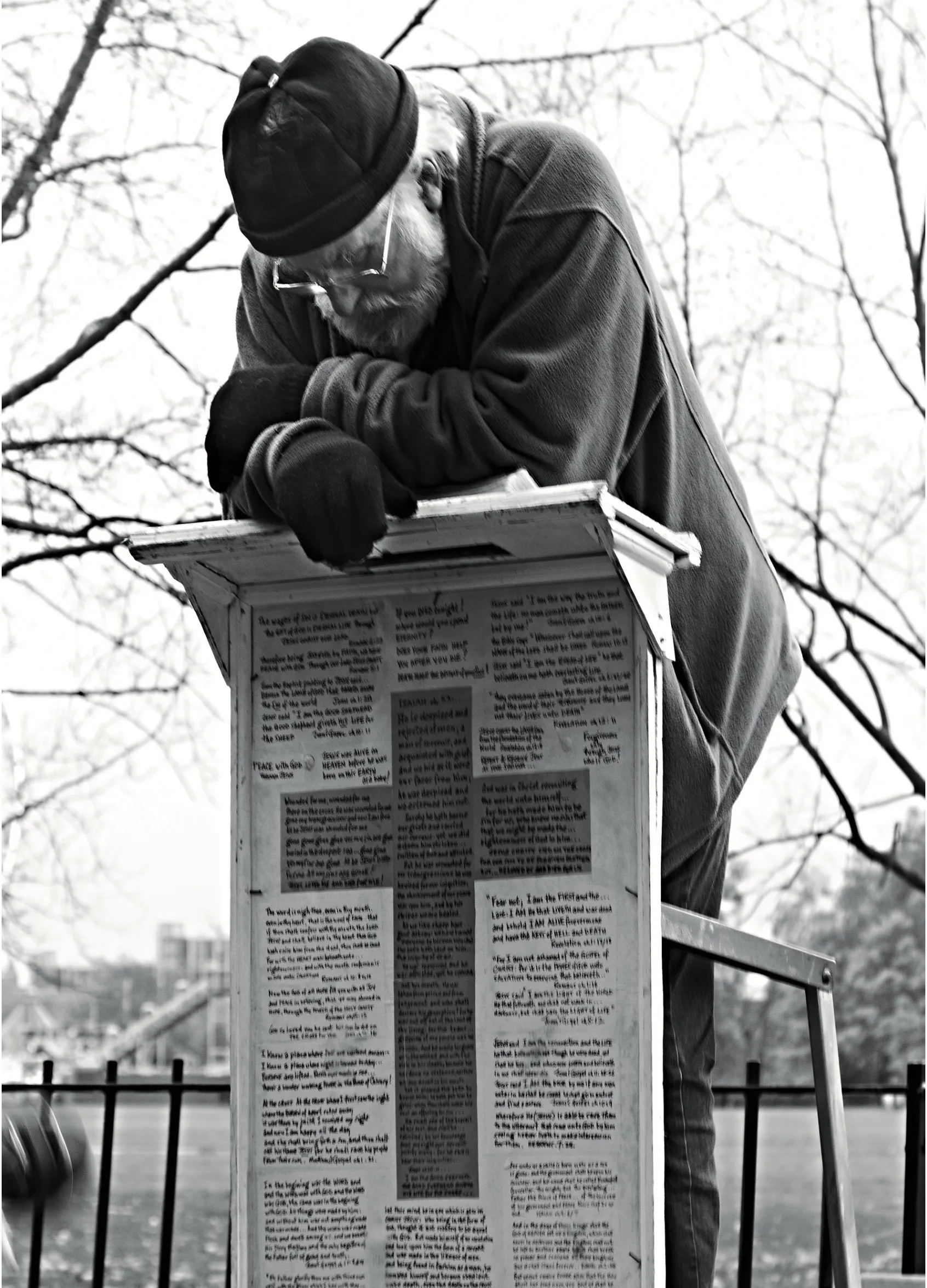
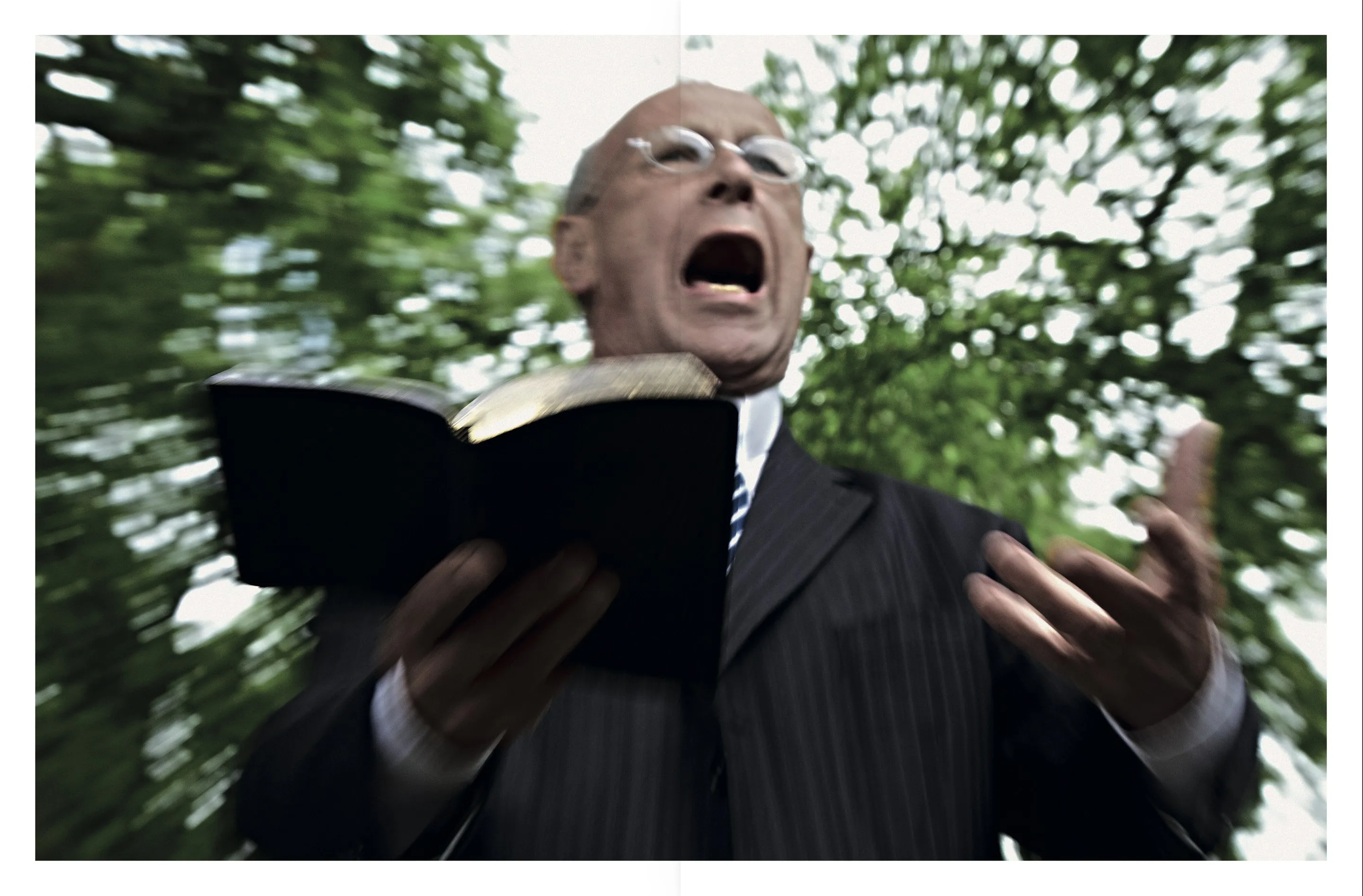
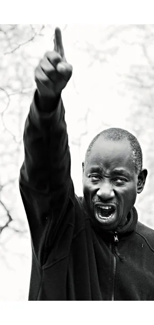
The idea was simple: print the pictures as a newspaper. Cheap paper, big pages, no gloss — the format that has carried this kind of picture for a century. The first issue, In Defence of Lost Causes, is about Speakers' Corner in Hyde Park, its speakers and its long history of free speech.
I designed the identity and the editorial layout in InDesign: a tabloid where the photographs set the rhythm and the text steps back.
- Sector
- Editorial photography
- Duration
- 2017 (UK)
- Team
- With Rick Smee, photographer
- Tools
- InDesign, Photoshop, Illustrator
My role
- Concept and format
- Masthead and identity
- Editorial layout and typography

The result
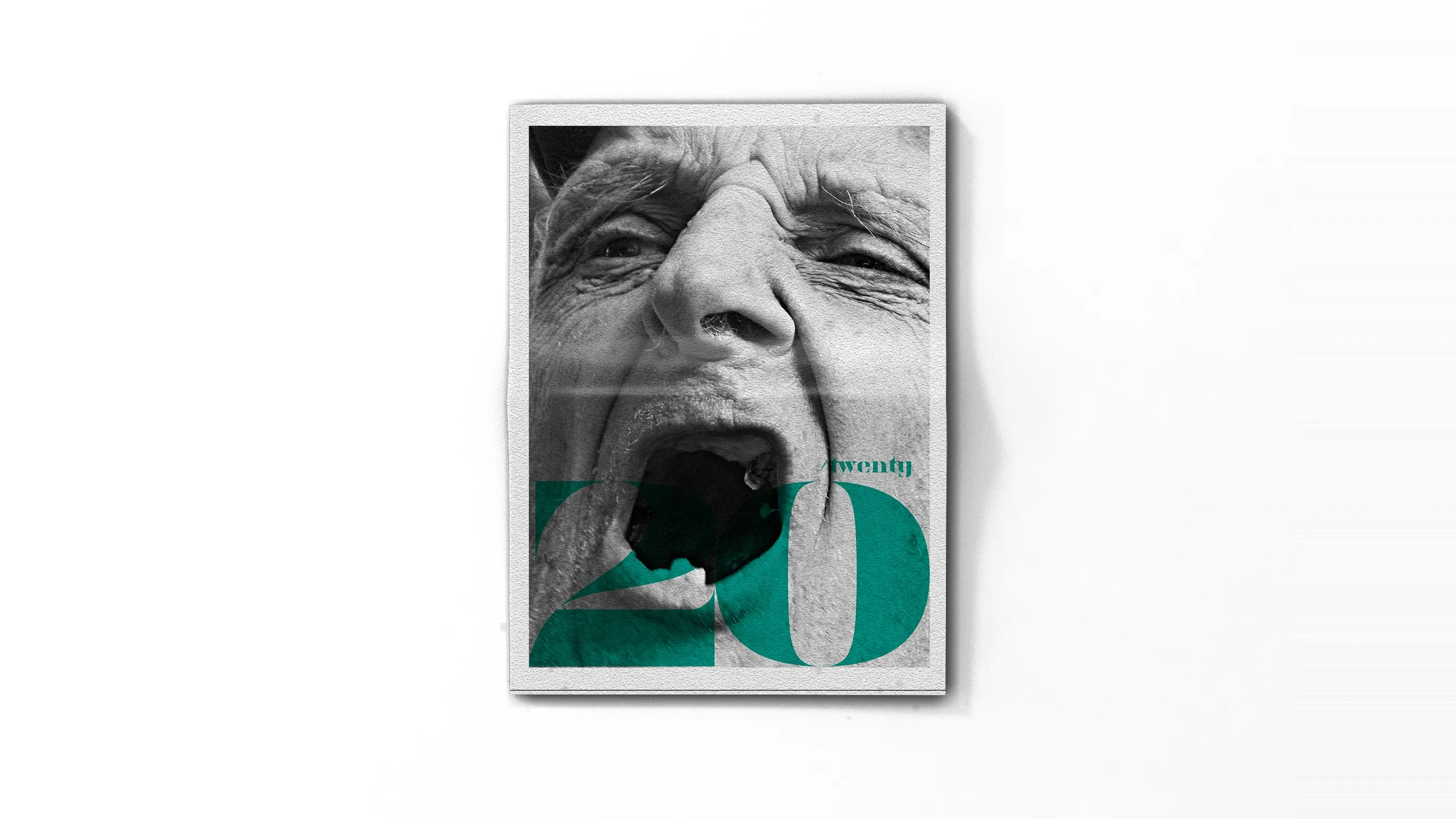
A 28-page tabloid where full-bleed portraits face short essays, with the green 20 of the masthead as the only colour.
Black and white, printed on newsprint: the pictures look like the news they document, and the periodical format lets every issue tell one story.