Deriva
Deriva • 2018 – 2019
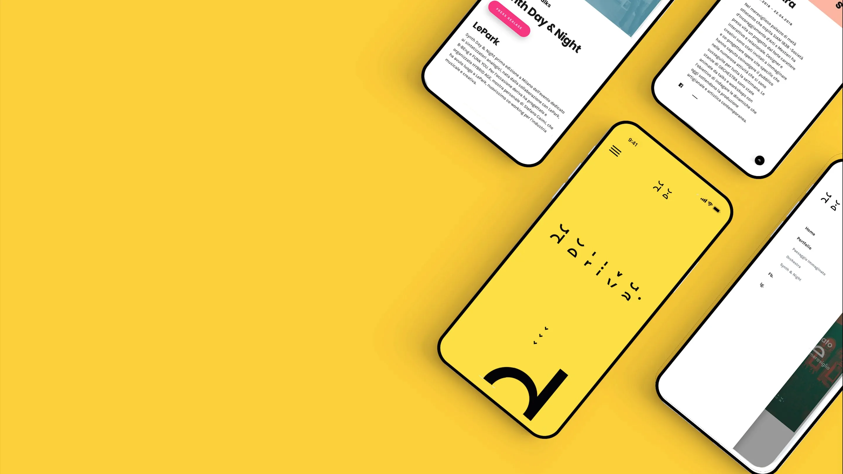
The challenge
A website for a Milan events agency that brings contemporary art out of the usual places.
Deriva organises and sponsors cultural events in Milan: art, music and talks in non-conventional locations, from an old palazzo to a park. In 2018 they needed a site that could present the agency, promote what was coming up and keep a record of what had already happened.
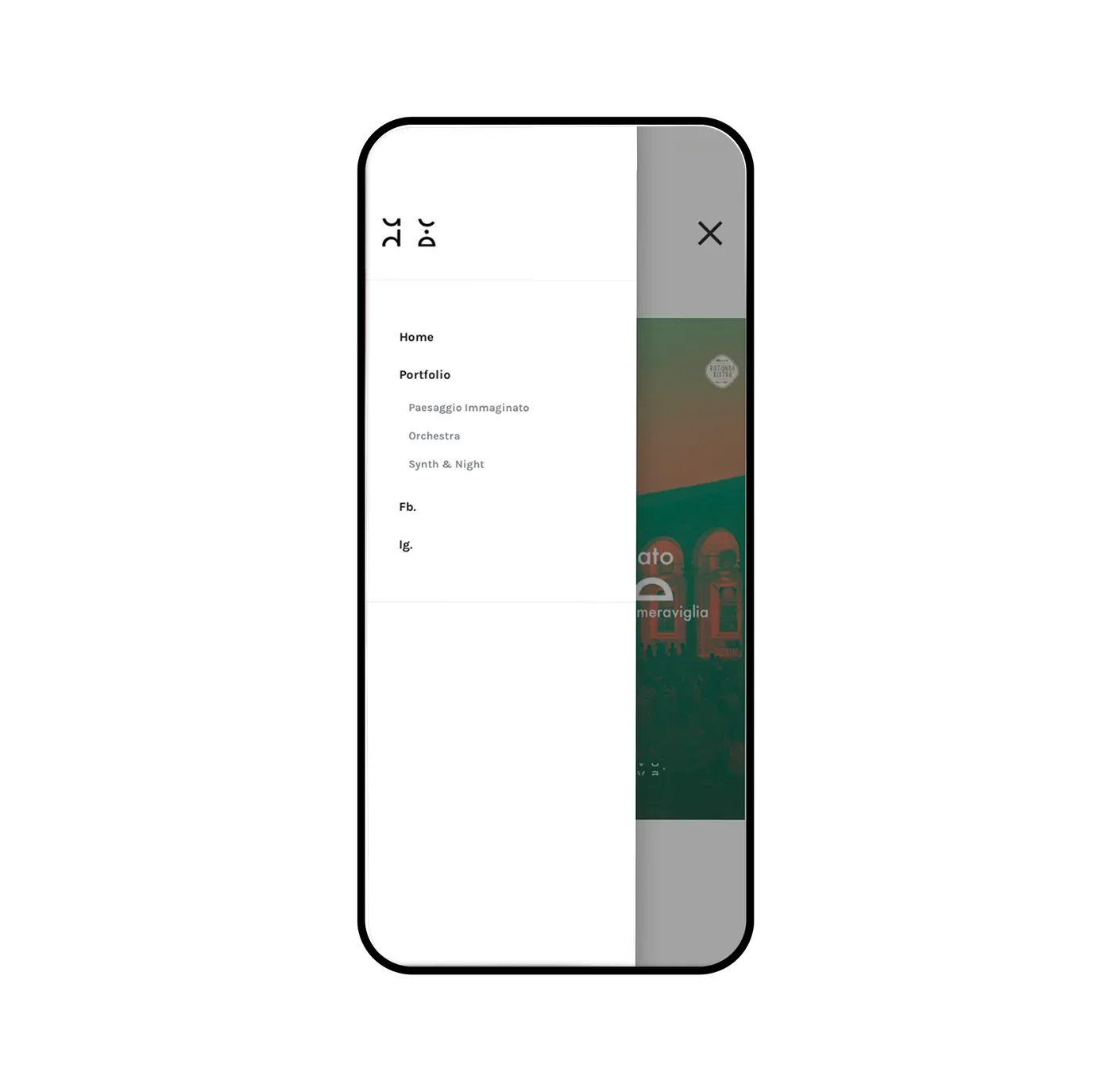
The brief was in two parts. First, design the website — home, events, gallery, contacts — as a layout ready to be built on WordPress. Then, once the layout was agreed, set up the theme itself and the content rules: how an event is created, which fields it has, how it moves from "upcoming" to "past" and where it appears on the site.
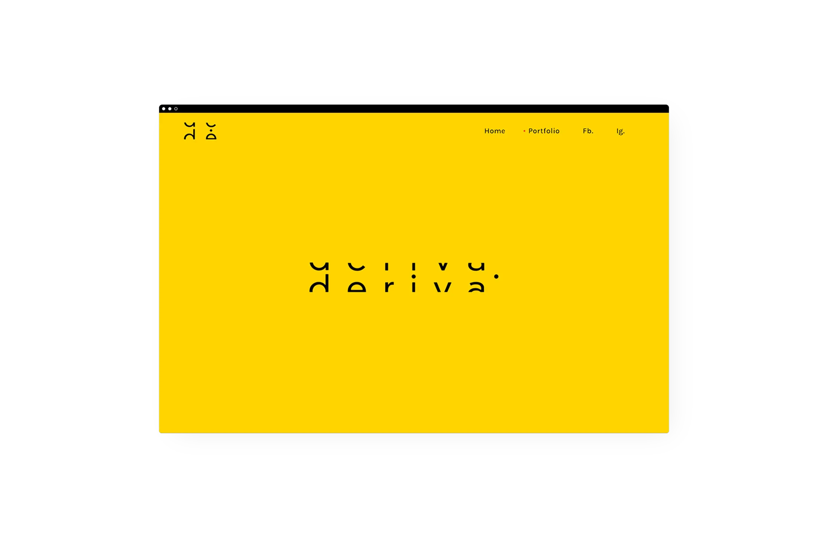
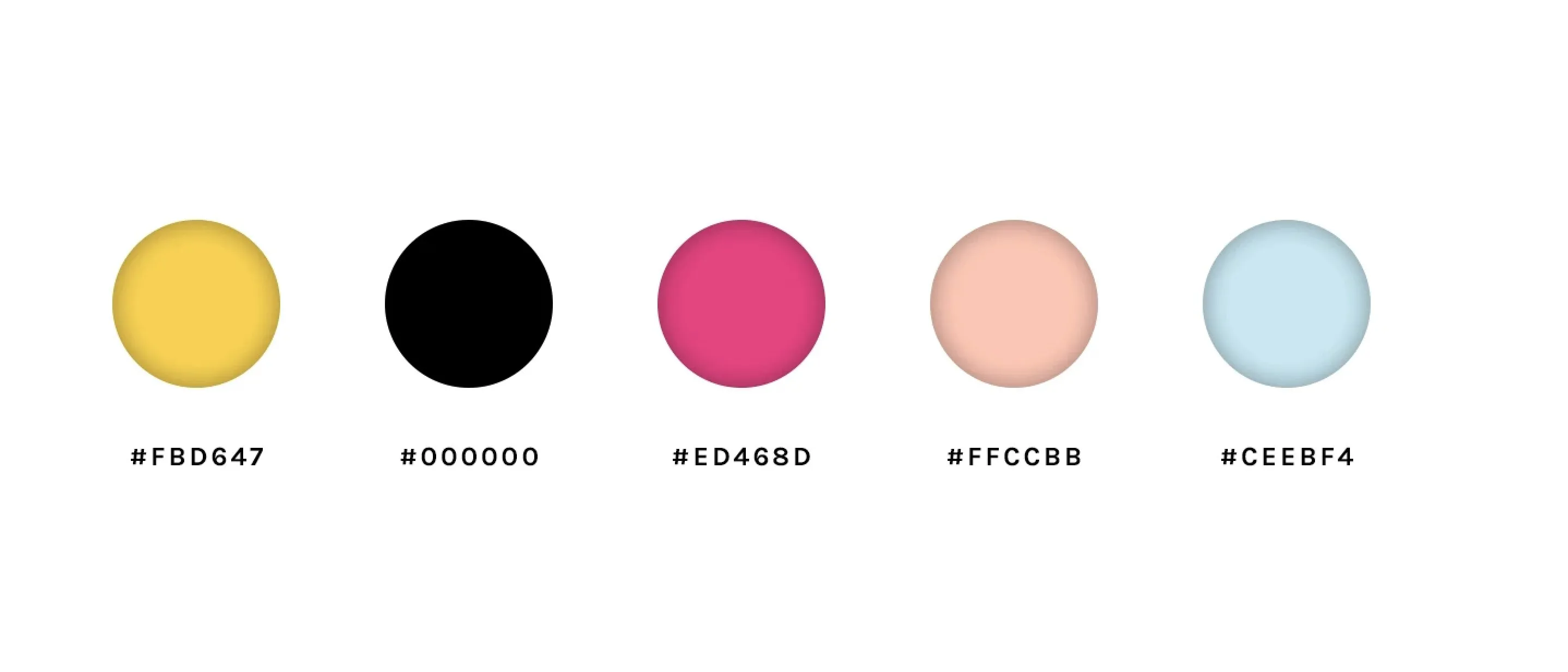
The identity was already there: the Deriva wordmark with its cut letters, a bright yellow, a touch of pink. The site had to feel like their posters — loud, simple, a little playful — and still be easy for the team to keep updated without a designer.
- Sector
- Cultural events — website
- Duration
- 2018 – 2019
- Team
- With the Deriva founders
- Tools
- Sketch, Photoshop, WordPress
My role
- Website layout (UX and UI)
- WordPress theme setup
- Content rules for the events calendar
Built on WordPress so the Deriva team could publish events on their own.
The result
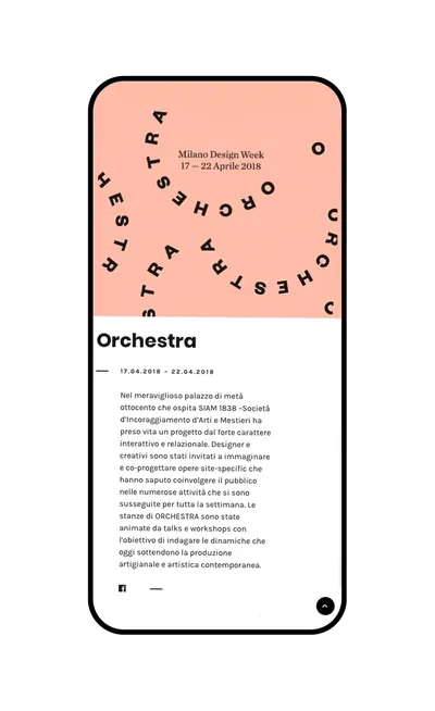
A WordPress site the team could run by themselves: each event is an entry with its date, venue, poster and text, and the calendar sorts it — upcoming first, then the archive of past events with their own page.
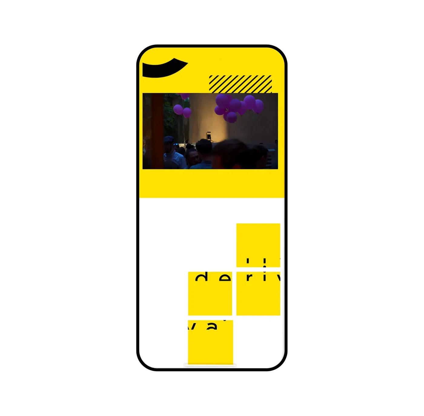
The layout keeps the yellow and the cut letters of the identity, so the site, the posters and the social covers read as one voice.